Project overview
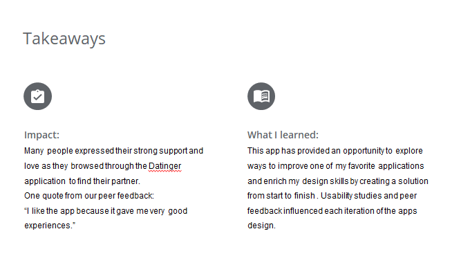
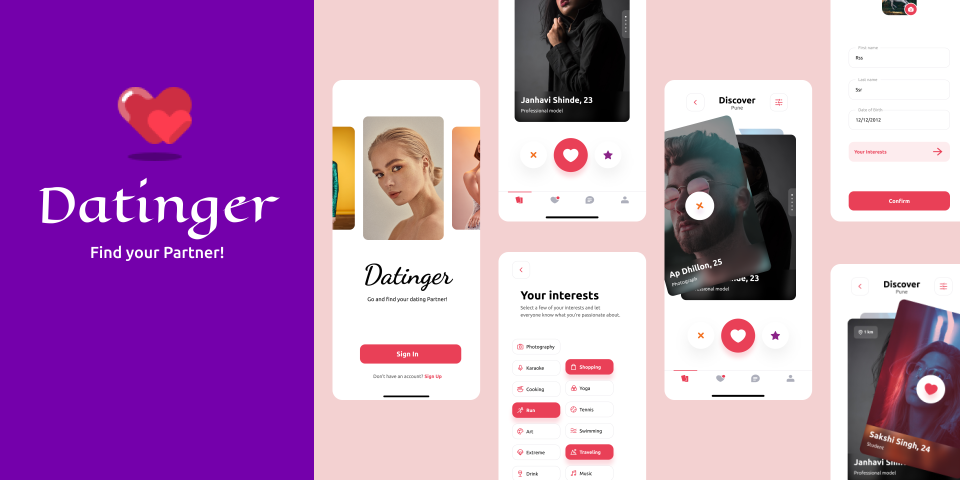
Datinger is the Dating App with more
ease to match people and do dating.It comes with more user friendly experience
which makes it fun to keep using.
The
problem:
Many users of popular dating apps
(especially men) feel dissatisfied with their experience on these dating solutions.
The majority of men struggle to get matches in significant quantities and many men find
that the vast majority of messaging with matches leads nowhere.
The goal:
Users come to your application with expectations,
whether that be in finding a partner or simply meeting new people. It’s important to
match your user’s with the right people in order to meet their expectations and have
a satisfied user of your app.
Understanding the user
I started the research phase with surveys. The survey was conducted among 300 single students. Here are some of the significant data that received:
the main problem is the difficulty of turning the matches into dates.
only a small percentage of men get matches in significant numbers.
girls frequently do not message back after male users send the first message.
even when the conversation is going well, users struggle to arrange a real life meet up.
dating within social circles tends to generally be a slow process with significant time between the first meeting and an actual date.
Persona
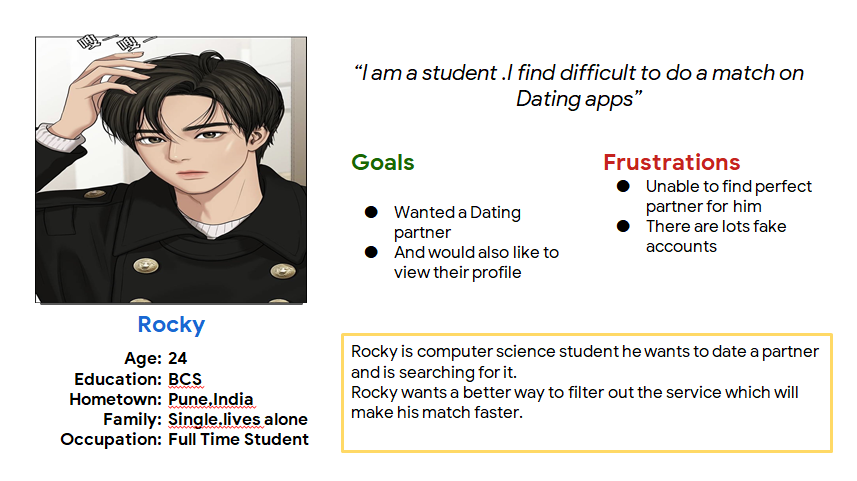
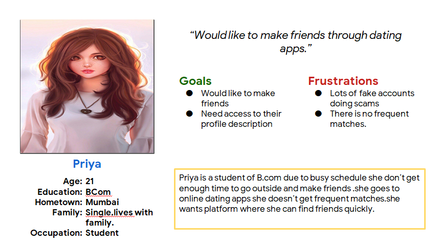
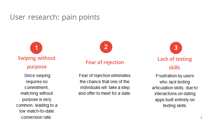
Pain Points :
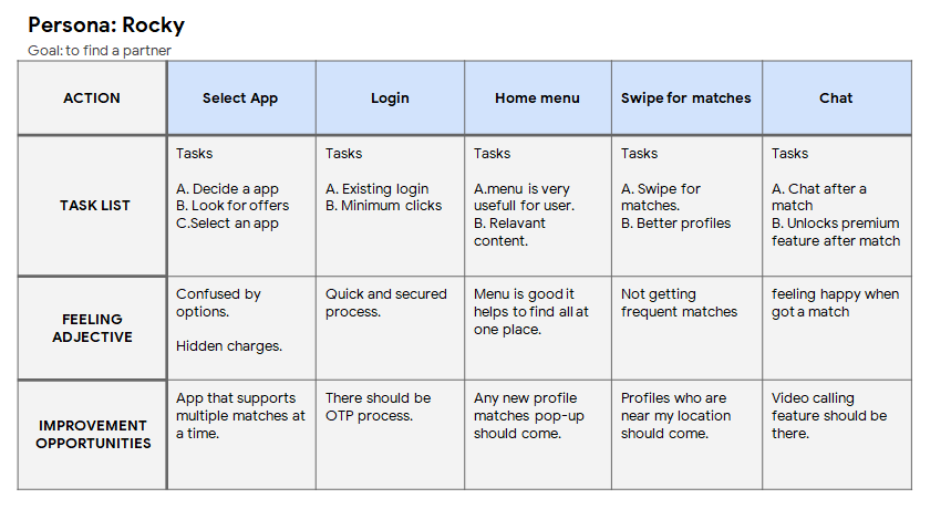
User Journey Map
:
Rocky's
user journey revealed how helpful it would be for
users to have access to
a dedicated Dating app.
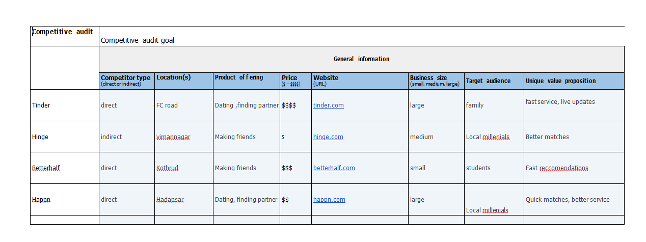
Competitive Audit
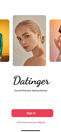
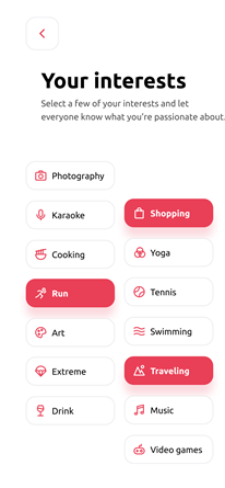
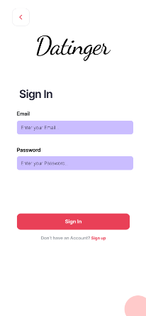
Key Mockups
High-fidelity
prototype
At this point I concentrate only on the
functionality and usability of the app when the goal is to create an intuitive experience with as few
frictions as possible.I decided to go with a dark moody vibe with pops of color here an there to feel
good to the users while using this app.
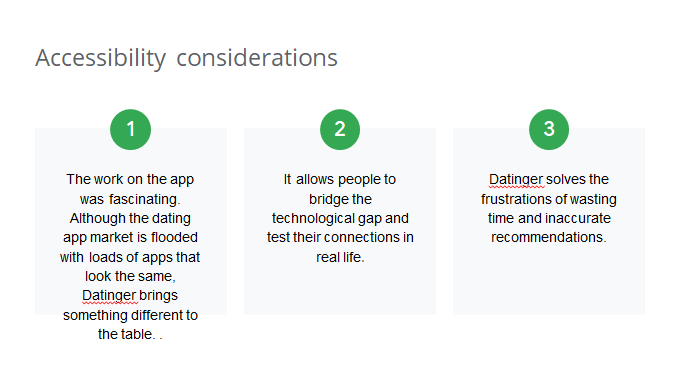
Accessibility
considerations
Takeaways
